Logos, Uniforms and Fishsticks
At least it’s not a fisherman.

That was my response to the unveiling of the new Winnipeg Jets logo. I was hoping they would do the same with the logo as they did with the team name; go back to the original, the classic. But, no. The logo and alternates are just some marketing president’s mashup of branding, modernization and…well to be honest it looks like an airplane getting it on with a maple leaf. Sexy.
But at least they can say it’s not the worst logo ever. Their uniforms will probably not go down in history with likes of the 80s Astros, the 1976 White Sox or the 80s Denver Nuggets as disgraces to their sports. There have been dozens of uniforms over time that have made fans less than happy to wear team jerseys and logos (Mighty Ducks, Portland Trailblazers) that had to put a dent in profits of the team store but there is probably no logo change as storied and horrifying as that of the 1995 New York Islanders.
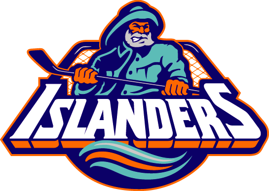
The Islanders - who play on an island as you may have guessed - had been represented on their jerseys by a logo whose main symbol was…wait for it…an island. Long Island, to be exact. You know, where they play. This was a good logo. The “Y” in “NY” was a hockey stick and everything you needed to know about the team was right there: We are a hockey team and we play on Long Island, in New York.Â
Somewhere in the offices of the Nassau Coliseum in the mid-90s, some management type person put pen to paper and started writing out ideas for changing the team around. “Hmm, we finished in the basement this season. What can we do to make better things happen? Make some trades? Fire the coach? Oust the GM? I know! We’ll let our leading scorer slip from our hands and then we’ll change the team’s logo!”Â
At the subsequent Team Logo Change Meeting (and I’m conjecturing all this, work with me here), the management and the marketing department and the sales department and maybe a few peanut vendors and the team mascot had a brainstorming session about new logos.Â
“What would represent Long Island the best?”
“Well….an island would, and we already….”
“CAN’T YOU SEE THAT LOGO IS MAKING US LOSE?”
And so it was decided that a fisherman would adorn the jerseys of the New York Islanders starting the next season. Not just any fisherman. An angry fisherman. A fisherman who looked like he was about to whack someone with his hockey stick. Perhaps he was angry because he had no legs.
“Well,” someone surely said, “representing the Bay fishermen is a nice touch and all, but Long Island is so much more than fishing, in fact…”
“Nonsense! Billy Joel wrote a song about the Bay fishermen so it must be a thing! A big thing!”
And then they added some teal to the logo because sports teams in the 90s love their teal and then they tweaked the fisherman and his fishing gear and voila! Instant hockey success!
“Hey, guys? This dude looks kind of like the Gorton’s fisherman.”
“I don’t know what you’re talking about. Who are you, anyway? Aren’t you the guy who sells peanuts in section 312? Why am I listening to you?”
So the new logo came to be and in the first game against the rival New York Rangers the Ranger fans chanted “We want fishsticks!” and somewhere out there, a peanut vendor shook his head sadly.

The backlash was immediate and immense. Islander fans stormed the team’s office with pitchforks and torches, demanding death to those responsible. Well, we wrote strongly worded letters and shouted “Maloney sucks” at games. Pitchforks are expensive, people.Â
In the end, the logo worked no magic. The team finished in last place again and became the laughing stock of the sports world. Management decided to revert back to the old logo immediately and the league said “Too bad. You’re stuck as The New York Fishsticks for another season.”
The team certainly earned a place in a dubious sort of history, though. When people rattle off a list of worst sports uniforms ever, the New York Islanders rank right up there with the Astros, Canucks, Padres, Raptors and White Sox. If you can’t be good at being good, you might as well be good at being the worst, right?
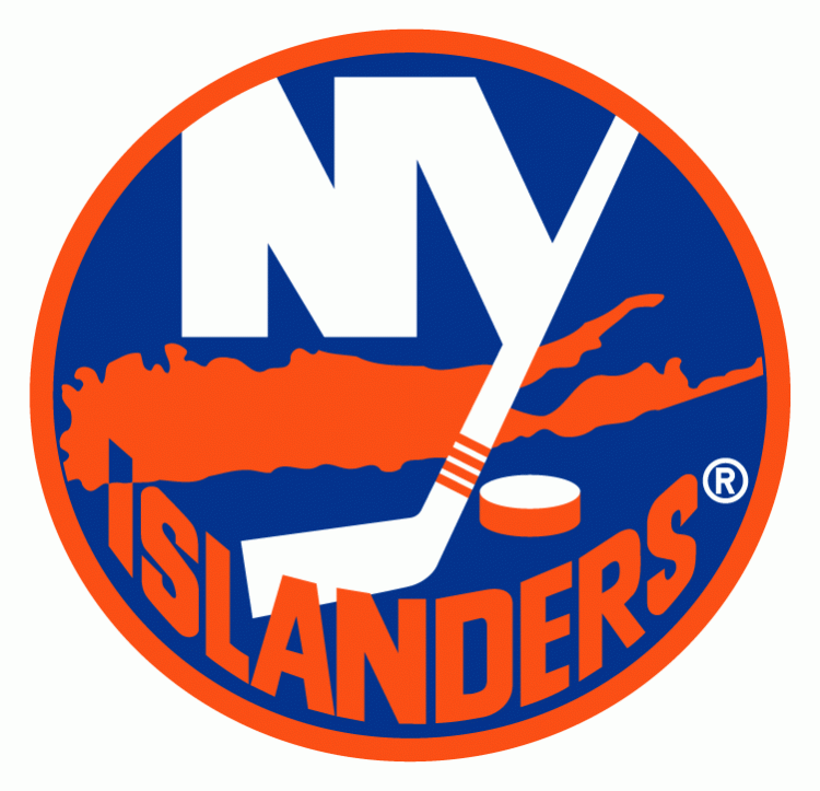
Long may you run, traditional Islanders logo. Or at least until you potentially leave us in 2015.